Statistical analysis must support your conclusions, or you’re just another ‘climate denier’
There is so much confusion about climate change and weather fluctuation, that even as a statistician, I have to stop myself from observing “climate change” during a heat wave, drought, or downpour.
Let’s review the definitions of weather and climate. There is a simple definitions on the NASA website,
“Weather is what conditions of the atmosphere are over a short period of time, and climate is how the atmosphere “behaves” over relatively long periods of time”
When the winter is mild, or the summer is really hot (like it has been the past 12 months here in the US), it’s hard NOT to conclude that this is evidence of climate change. However, one year is a very small period of time, so we need to draw conclusions based on multiple years worth of weather patterns, and compare them to historical results and variation in those historical results.
Watch this short one minute video that explains the difference between climate and weather, using a man walking a dog as an example.
There is also an article that discusses the skeptic view of climate change, that is summarized in the graphic below. If you don’t know what you’re doing with data, you can manipulate it to support your views. However, that’s why we have peer reviews, to make sure it’s not just one person’s opinion.

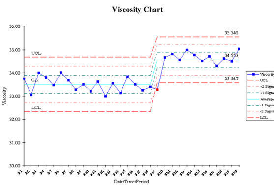
Bottom line, when drawing conclusions from your data, there needs to be a statistical answer that goes along with your results, not just “hey, look at the chart, it’s going upwards, therefore my idea or improvement is working!”
Often times, the statistical conclusions can arrive much later than the visual cues you see on the graphs and charts. This can be frustrating for people, but the rigor of letting the data decide when it’s safe to make that conclusion prevents us from having to go back and correct ourselves, which can hurt your credibility.
To make statistical conclusions, the data has to show that the probability of this event or trend happening due to random chance is less than 5%. That is a standard percentage across most industries and scientific papers. Often times, it is reported as a p-value, which reflects this probability. If the p-value is less than 0.05, then it is acceptable to conclude that a change has been observed in the data that varies greatly from historical results.
You need to make sure you are applying scientific principles to decisions you make. We all have a tendency to be biased towards one answer or another, especially when we are validating the improvements we personally implemented. There is a tendency to show how the data is supporting an improvement, when the data doesn’t statistically back it up (at least not in the sample of data you have so far). We have to be honest with ourselves, and show that the statistics are on our side, not just show that the charts and graphs are headed in the right direction.
If you have questions about your data, and whether you can draw a statistical conclusion or not, let us know, as we’d be happy to answer any questions you have.

